 Puns and seasonality aside I really am stunned by the leaps in mezcal world design. Bottle shapes and label design have always expressed the awesome creativity seeping out of Mexico but now people are creating all sorts of other containers. This last trip to Oaxaca presented me with two: Hopefully this article will prompt still others. Rest assured I’m also working on a piece specifically about label and bottle design so send me your thoughts on those fronts as well. For now I just want to talk about a few boxes.
Wood boxes for alcohol have always been special. Wood wine cases used to make awesome containers for CDs, bed tables, and sundry other boho furniture. Their tactile sense said, ‘this is something solid, real, a part of a tree worth keeping.’ I always used to pick them up outside of wine stores and only later clued into the idea that spirits were doing the same thing. Cognac obviously has a history of using wood but tequila has never been a slouch in the marketing department and makers like Jose Cuervo have created a special box annually since 1995 to celebrate their bicentenary. They call it the Jose Cuervo Reserva de la Familia Tequila and it’s quite a spectacle, take a look at Tequila Source’s comprehensive pictoral history here. Here are a few boxes just to give you a sense of the scope:

Now we’re finally seeing really cool packaging for mezcal too.
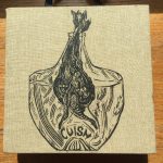
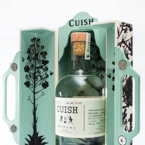
My first inkling was a Cuish boxed set that I bought from one of our favorite couriers on a San Francisco street corner a few years ago. It expresses all the outré illustration topics that seem to come up when artists meet mezcal.
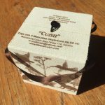
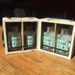
Cuish still delivers the goods. In January when I visited their little bodega in Oaxaca I was happy to find a small cube that opens to reveal four 50ml bottles of their selections. This one has much more sedate illustrations that stick with the 400 conejo, colibri, and quiote motifs.
It is such a nice form that carves out its own space on the bar but it’s also practical: Not only do you have airplane minis of mezcal for all your travels, this box has handy handles to make it your portable companion. They should really set up an annual subscription, in the interim pay attention to their Facebook page because they have a handsome new box on sale now.
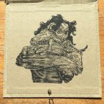
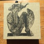
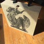
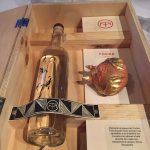
But the real award for boxed mezcal design has to go to Mezcal Tosba who worked with La Madriguera Gráfica to create an amazing limited run package which includes prints, a bottle of Tosba mezcal, and a design that makes you want to leave it on the coffee table.
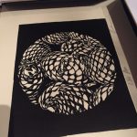
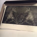
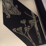
Each box has is custom screen printed with a variation on the animals in the mezcal universe. This example is obviously the scorpion model. The boxes contain a bottle of Tosba with the corresponding print, a hand decorated jicara, this one is a bat, as well as a package of hand made prints. I feel all the old art sales cliches rising to my throat – yes, these would really look fantastic on your wall and are definitely collector’s items – but stop to admire the whole package because it’s worth your while. They’re priced accordingly and are extremely limited so get into contact with Tosba’s Elisandro Gonzalez for more information.
Here’s hoping that this is a trend. I’d love to see more like this.








Leave a Comment