Can you judge a book by its cover? Honestly, sometimes you can. The same goes with labels–whether wine, whiskey, or mezcal. The savvy drinker knows how to read a mezcal label. It may not tell you if the wine or spirit is actually going to be a good match for your palate, but it will divulge clues about its quality. But I digress. Today, we’re talking about design. And while I’d happily sample any of the bottles on this list, what we’re looking at today is art.
Back in the day, Del Maguey set the tone for mezcal labels by choosing a bottle that stood out on the shelf and by using specific artwork created by Ken Price for each village or expression. Emerging brands took the ball and ran with it, with diverse and interesting results, making a good mezcal collection arguably more visually interesting than your average booze shelf.
What are the best mezcal labels? In this instance, we’re considering the overall brand profile, not a specific label on one expression. So we’re looking at brands that either create a multitude of interesting labels or just have great and consistent style across the board. We’ve considered best representations in certain categories: for example, simple vs. intricate. But we’ve also been on the lookout for interesting outliers who are doing something that feels truly original. Here’s some favorites (in alphabetical order), but this list is by no means definitive. Hit us up if you’ve seen something striking that we’ve missed!
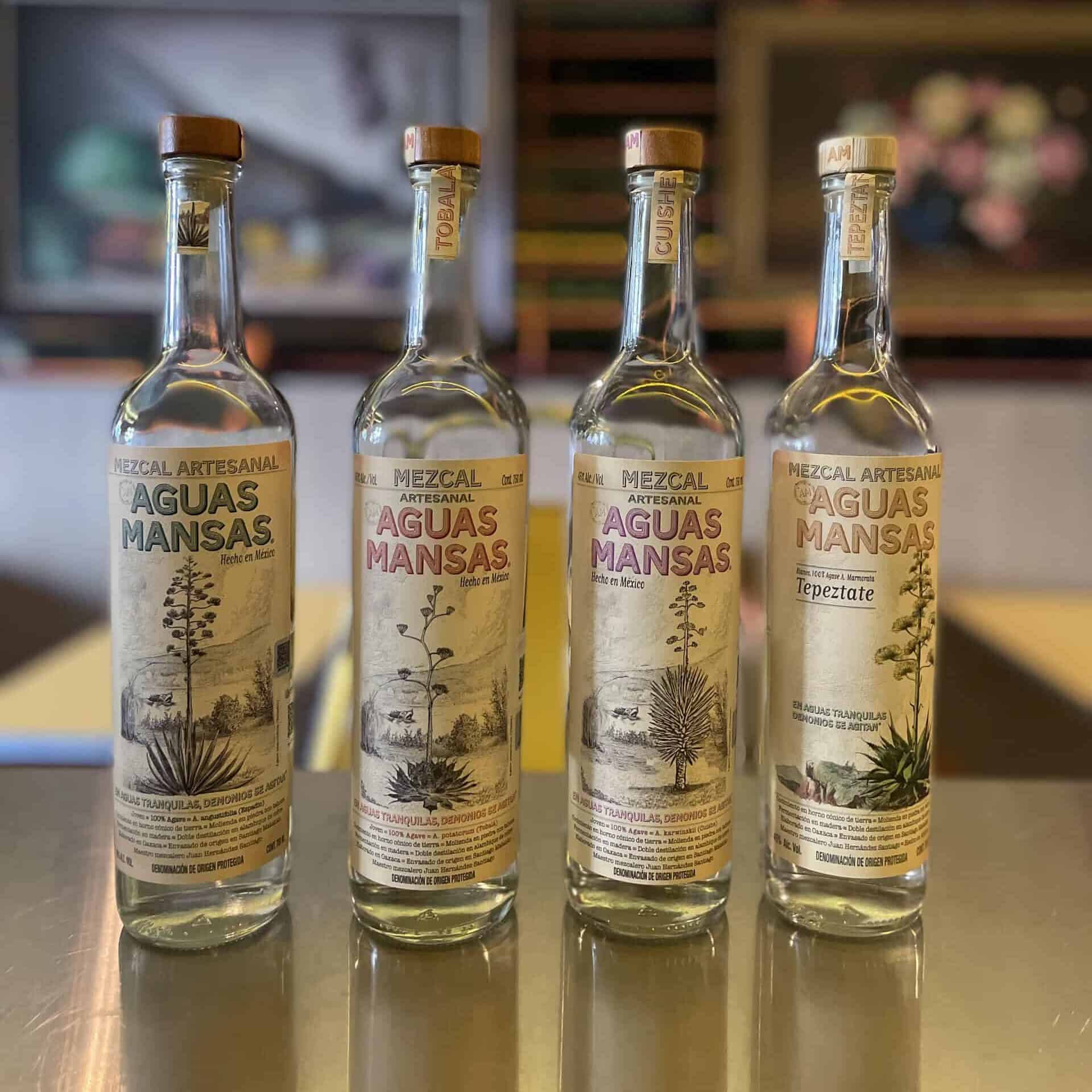
Aguas Mansas
We love a good botanical drawing, and the Aguas Mansas labels capture the arid beauty of the Oaxacan countryside while evoking a sense of history–with a surreal twist. Most Aguas Mansas labels feature a flowering agave in front of a lake, where a mischievous “seamonster” rears its head. This is a reference to the quotation that also appears on each bottle: “En aguas tranquilas demonios se agitan,” which translates to “In tranquil waters, demons stir.” Hence the brand name Aguas Mansas, or “peaceful waters.”
The labels were designed by Guillermo Escárcega himself–the man behind the brand. The agave depicted on the bottle varies by expression, as does the logo color. The drawings are actual botanical illustrations that Guillermo modified digitally. The Tepeztate is the only label that’s full color–Guillermo says he wanted to depict the most striking of all quiotes.
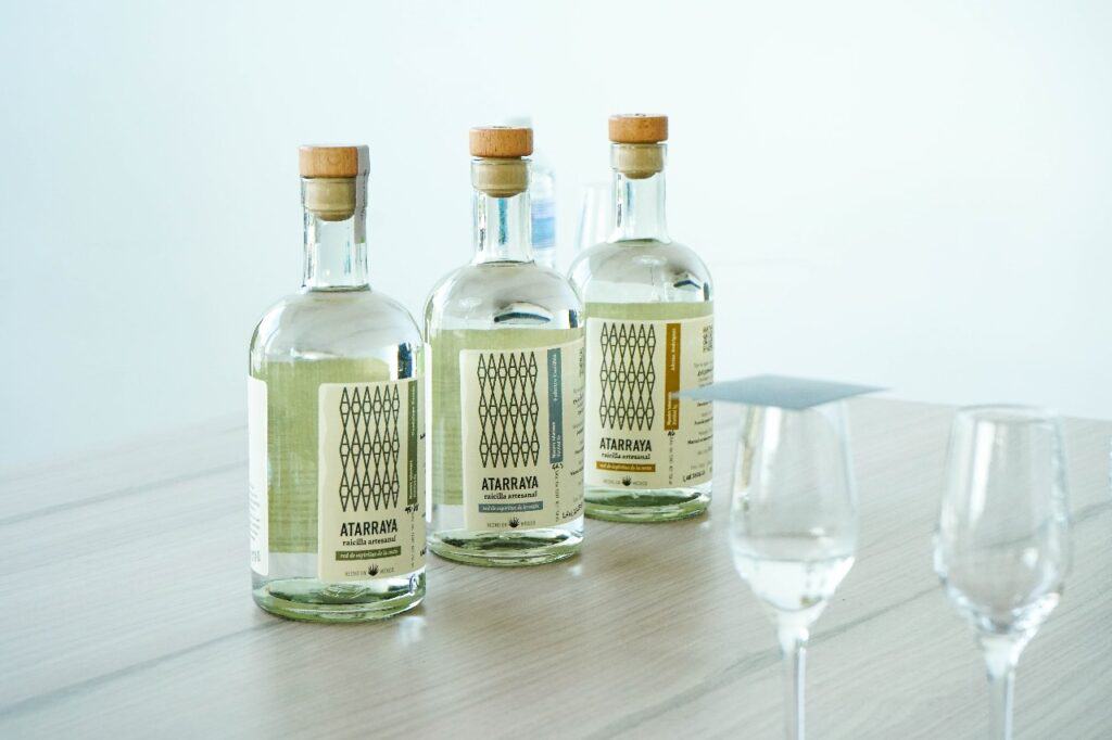
Atarraya
Atarraya co-founder Arturo Dávila is obsessed with the history of coastal raicilla and the Filipino connection. The brand was created to highlight the work of coastal raicilla producers, who are living representatives of one of the oldest mezcal traditions. This focus on coastal culture is beautifully emphasized in Atarraya branding. Atarraya refers to the casting nets that are still a mainstay of Jalisco fishermen, and a stylized net design is reflected on the squat yet sleek bottles. The back labels feature sketches of the boats that traditionally ferried raicilla from remote coves to market. This is a great example of thoughtful branding that reflects intent. Artutro gives the designer, Javiera Pintocanales, full credit for the idea, the art, and the conceptual unity.
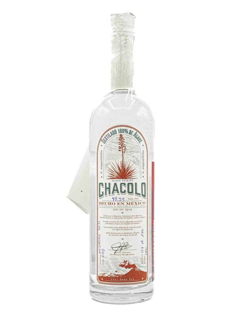
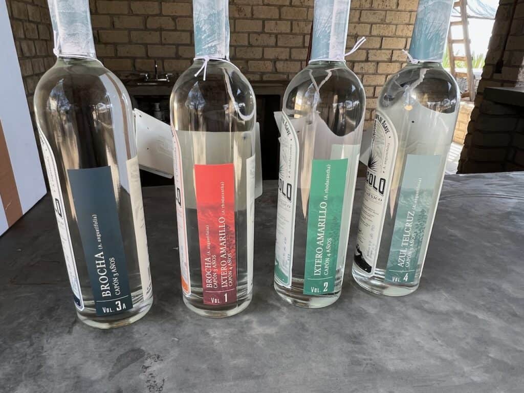
Chacolo
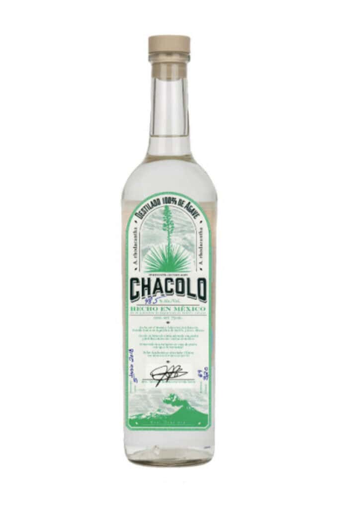
I may be a sucker for botanical illustrations because the new labels from Chacolo are in a similar vein as Aguas Mansas, but stylized and offset by smoking volcanos that evoke the region where this destilado de agave is produced. The emphasis on the land seems appropriate for a family with a keen understanding of terroir, people who have put a tremendous amount of love into their farming methods. Another striking aspect of these labels are the colors–the purple of the Chacolo Lineño is particularly gorgeous, as is the sprightly green that denotes their Ixtero Amarillo (A. Rhodacantha). These bottles are refined yet vivid–like the mezcal inside. Designer unknown. Learn more about this sustainable mezcal brand.
Cuentacuentos
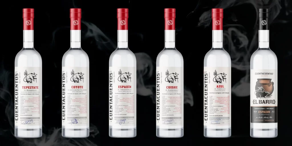
I have not yet tried any of the expressions from Cuentacuentos, and this possum seems pissed about that. Cuentacuentos curates small-batch Oaxacan mezcals and agave distillates from numerous producers. Although the possum has a big attitude, he only takes up a small bit of real estate on the labels, which are largely devoted to information on the producers and production methods of each expression. The artwork, by Cesar Ruiz Conseco, depicts the divine mythical marsupial, or tlacuache, who went to a demon party to steal mezcal, cigarettes, and fire–as a service to humanity. That’s my kind of mammal!
Grulani
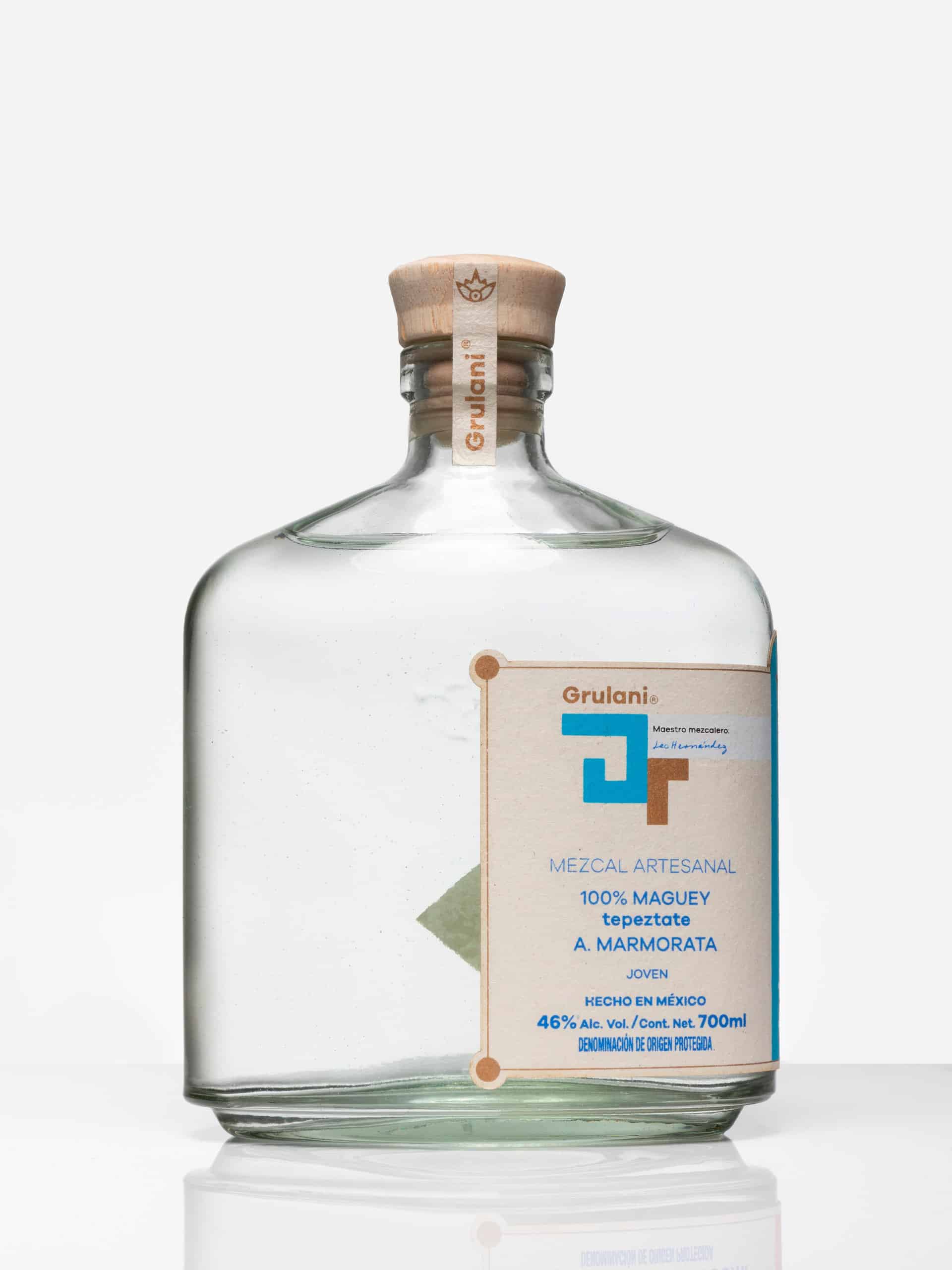
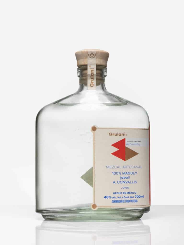
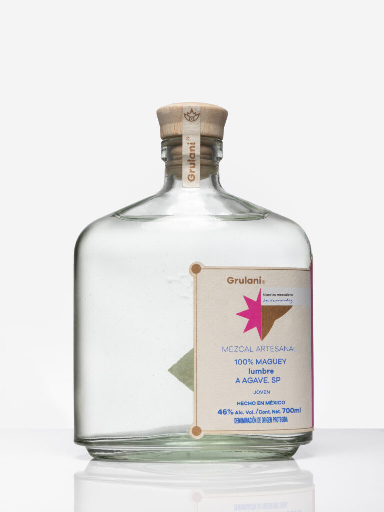
An atypical bottle shape and off-center label catch the eye. This is another Oaxacan mezcal I’ve never tried, but I’m game after reading Max’s profile of maestro mezcalero Leo Hernández, who began working in his father’s palenque at age eight. Hernández exclusively distills single-agave mezcal, and he loves to focus on rare or challenging agaves such as lumbre or jabalí. Victor Moreno Santos is responsible for the brand side of Grulani, which mirrors the focus on the rare and unique. The bottles are hand-crafted from recycled glass–some even come with neat wooden stands and beautiful paper boxes. The designs are inspired by Zapotec iconography and printed on maguey fiber labels.
El Jolgorio
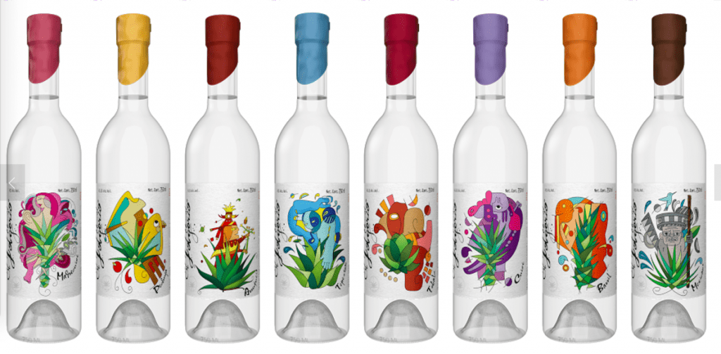
While many mezcals feature different agaves or colors for each expression, El Jolgorio goes the extra mile with a wide portfolio of creative art by Alejandro Peña, Alberto Almánza, and Asis Cortes, who is the nephew of brand founder Rolando Cortez. (With other family members, Asis went on to create the mezcal brand Dixeebe.) El Jolgorio is a notable brand on a number of levels, so they probably didn’t need fancy labels to get attention. But it seems fitting that a brand known for showcasing rare agaves would take care that each bottle looks as special and unique as its contents. All three designers retain brand congruence through bright colors, fluidity of line, and playful interpretations of indigenous themes.
Kilinga Bacanora
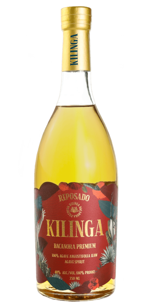
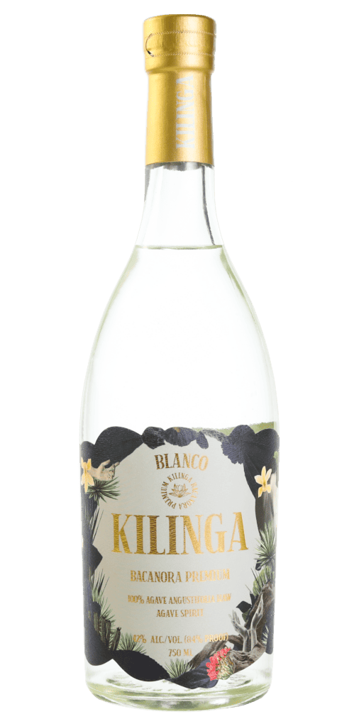
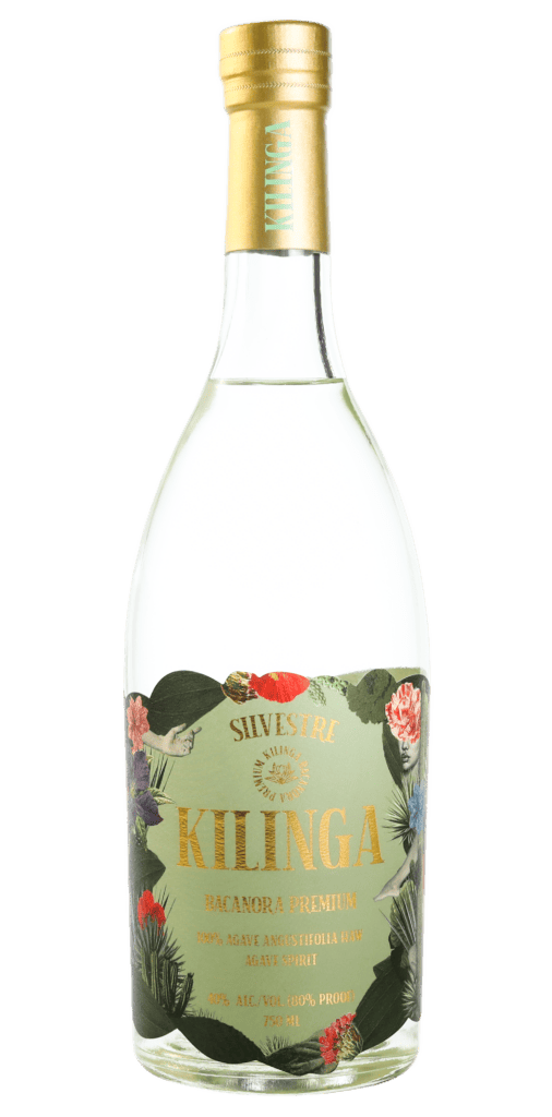
Like many things from Northern Mexico, bacanora has something of a macho reputation. Instead of leaning into this, Kilinga has chosen a softer, more delicate path. A collage of desert botanicals frame the elegant gold label. Even the bottle shape, reminiscent of wine, is unique for a mezcal from Sonora. In the words of our esteemed founder Susan Coss, “Everything about it looks more feminine, counterintuitive, interesting.” The branding is purportedly the work of Algoritmo Design.
Legindario Domingo
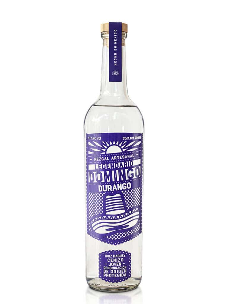
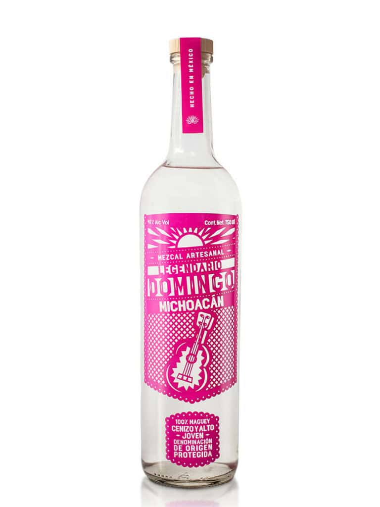
Truly original, Legindario Domingo pops from the shelf with its distinctive and colorful design modeled on papel picado, or the paper (or plastic) flags that are the hallmark of Mexican fiestas. Founder Julian Saenger told Max “The idea was to reflect Mexico, but I didn’t want to do it with those traditional designs sometimes you see on old tequila bottles or with a borrachito [drunk] sitting next to a sahuaro with a hat.” Instead the brand’s colorful motifs evoke the key elements of a fiesta: guitars, piñatas, and of course mezcal.
Marca Negra
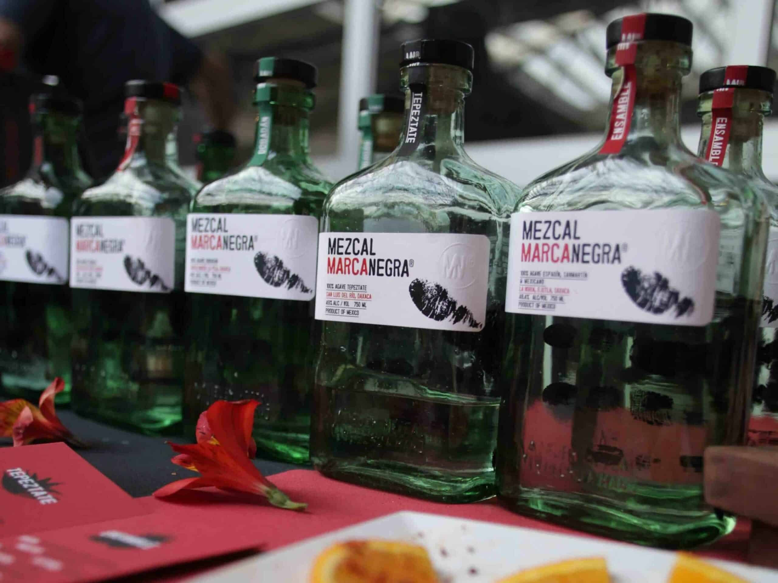
A bold black handprint adorns a hand-blown aquamarine bottle. The fingerprint on each label of Marca Negra mezcal is a thoughtful tribute to the producers, who also sign each bottle. This is fitting for a company whose stated aim is to elevate mezcaleros and source the best mezcal from small producers across Oaxaca–without interfering with their preferred processes. Designer unknown.
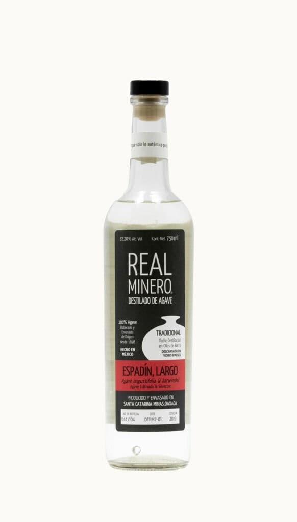
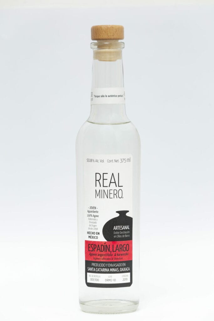
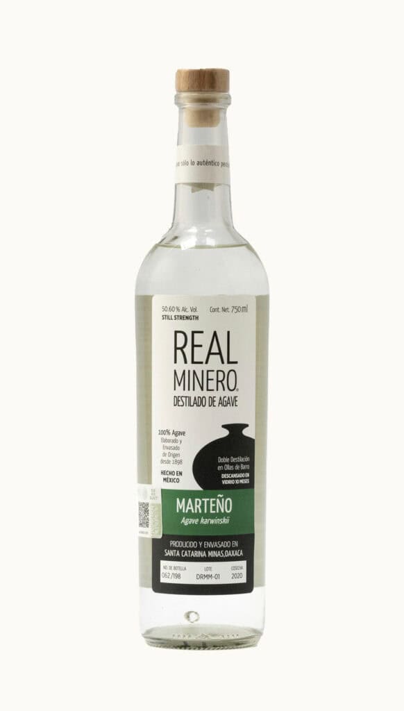
Real Minero
If you’re nerdy enough to be reading an article about mezcal labels, Real Minero likely needs no introduction. The original sketch for the labels were designed by Sara Trigueros and Ezequiel Terán of Studio Morpho, who have been working with this family-owned brand since its commercial inception 14 years ago. The final design was done by Mr. Nills Dallman and Axel Hunh, and was initially only intended for the German market but has since been incorporated into the labels we see in all markets today. A black-and-white clay pot motif evokes the ancestral practices that the family holds so dear, with the agave variety or ensamble listed in a colored band. The font is great too.
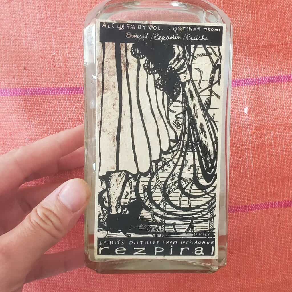
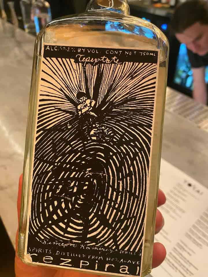
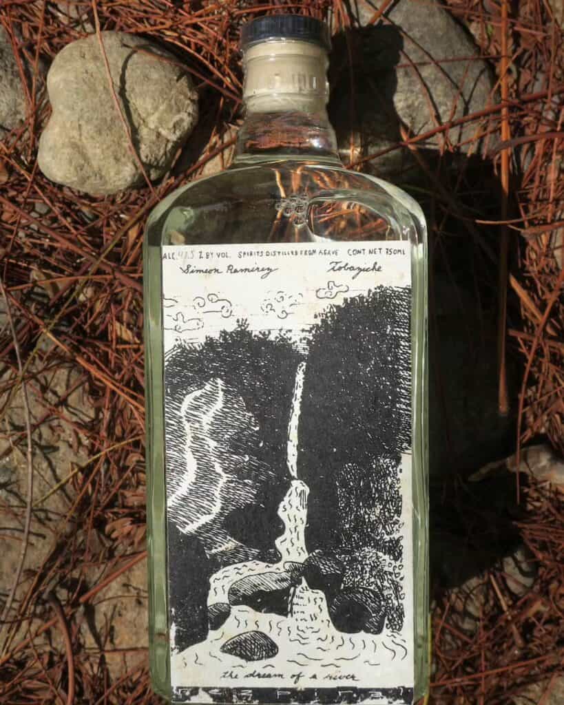
Rezpiral
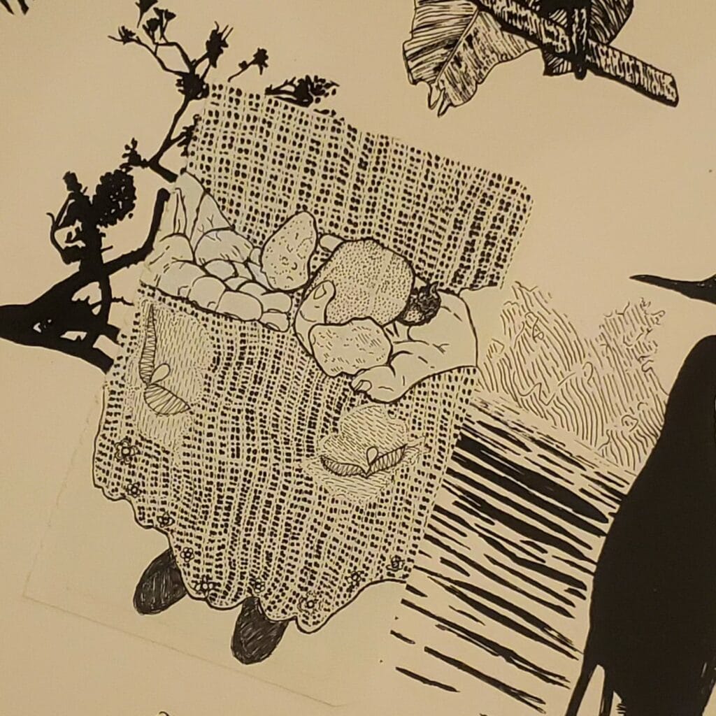
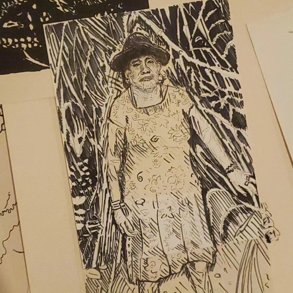
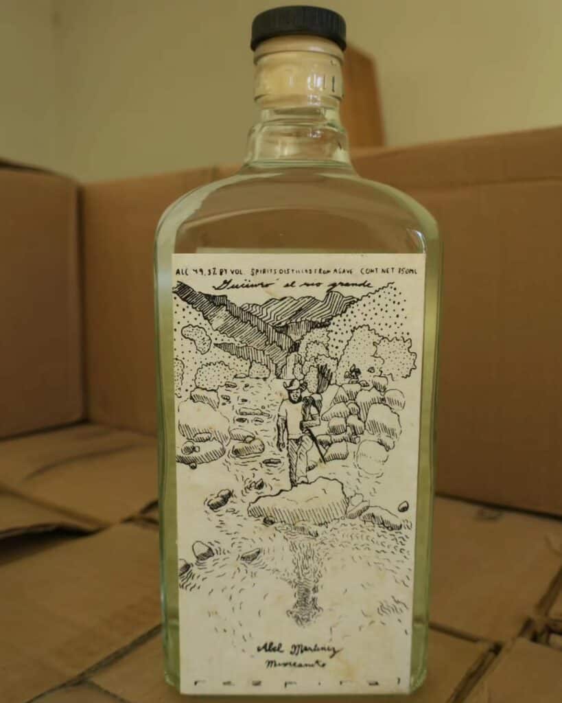
Founder Alex White considers Rezpiral a project rather than a brand. “I took on this idea: What does it mean to decomodify something?” he said. Part of what it means is profit-sharing and supporting the autonomy of mezcaleros. The project is built on meaningful long-term relationships with Oaxacan mezcal producers, connections Alex reflects in the artwork on Rezpiral bottles. Alex draws intricate imagery, then screenprints onto amate, a handmade paper from Puebla. He says it can be a two year process to create one label because his drawings are visualizations of narratives–his own thoughts and conversations he’s had with the producer in question.
“With a real relationship, you’re conscious of what the producers are going through, what their challenges are,” he says. These challenges are reflected in the drawings. For example, all of his recent work is about water—which is certainly a challenge for more people as Oaxaca faces a water crises.
Despite the time commitment he puts into labels, Alex estimates he’s created hundreds. The idea that mezcal itself is art has certainly shaped the mythos around the spirit, and Alex is taking it to the next level.
Tosba
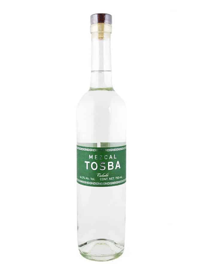
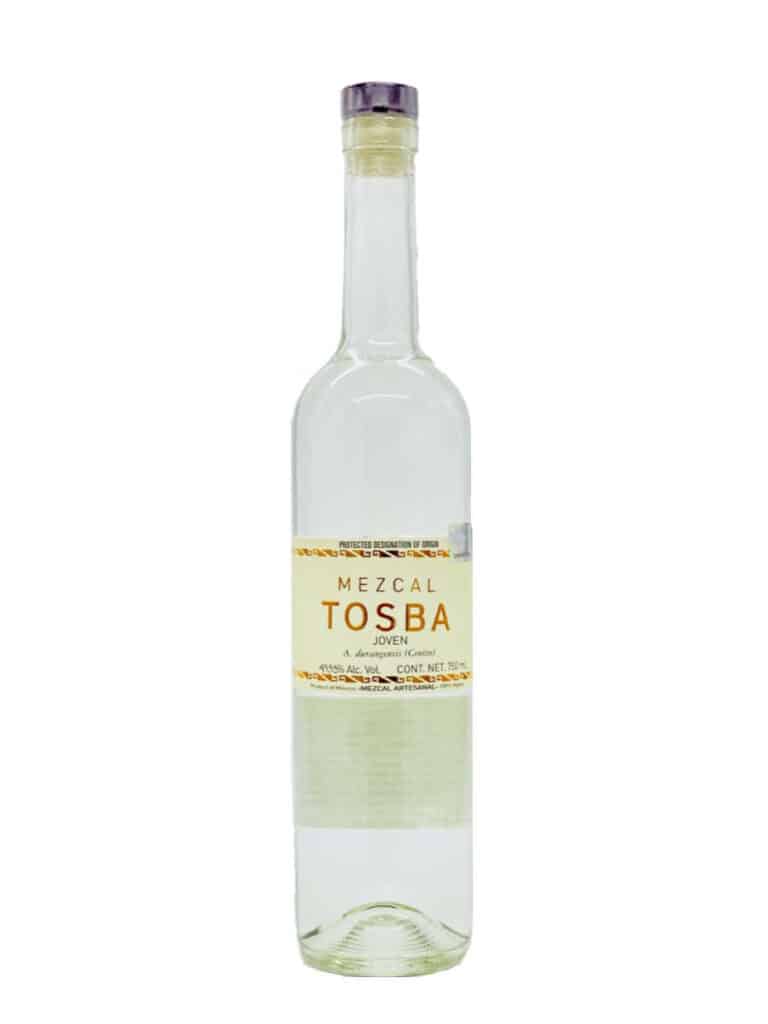
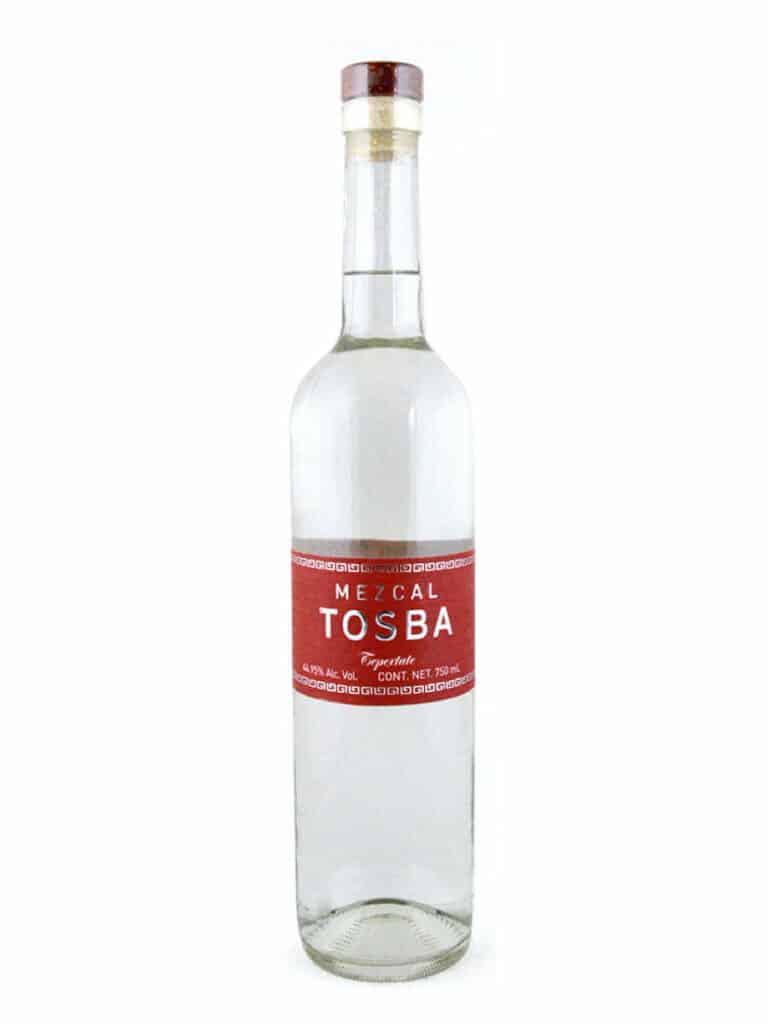
For a spirit category, mezcal has an unusual abundance of busy labels, and you’ll find some on this list. As a palate cleanser let’s take a look at the clean, classic look of Tosba, a brand started by cousins Edgar and Elisandro Gónzalez Ramirez. Edgar and family produce in their homeland in the remote Sierra Norte of Oaxaca, a stronghold of the Zapotec people. These labels come in several bold colors adorned with silver bands in a Zapotec motif. Tosba means “only one” in a Zapotec dialect, which may be a little tongue in cheek. Design by Elisandro’s friend, Gael Valdy. To learn more about Tosba, check out Journey to the Sierra Norte and Mezcal Tosba.
**Updated 11/19/2024 to include additional attribution for the design of the Real Minero labels.


The Real Minero labels were NOT designed by the people mentioned above, but by Nils Dallmann from architecture office Usos y Costumbres and myself, Axel Huhn from the German importer Mezcalería Berlin. We took the motif of the ceramic pot as the logo from the existing label, all other elements, format, font etc. were designed in 2010 to enable the brand to be exported outside Mexico for the first time.
http://usosycostumbres.com/
https://www.mezcaleria.de/de/